
How to Read Your Social Media Analytics and Find Your Top-Performing Posts
To read your social media analytics in one place, connect your accounts to a tool like Socialic and open the Analytics page. It rolls every connected platform into one dashboard: how many posts you published and how many failed, engagement over time, follower growth by platform, per-channel and per-platform totals, your content mix by type, and a ranked list of your best posts. Filter by date range, drill into any single post for its full metrics, and export the channel table to CSV.Native analytics on each platform tell you how that one platform is doing, in that platform’s own layout, with that platform’s own words for the same thing. Comparing them means seven tabs, a spreadsheet, and an hour you do not have. A single dashboard is what turns “checking analytics” from a monthly chore into a fifteen-minute weekly habit.This guide covers which numbers actually matter, then walks the Analytics page top to bottom: the summary cards, the engagement and follower-growth charts, the channel and platform tables, the content-mix breakdown, the top-posts list, and the per-post detail view.The Metrics That Actually Matter
Before reading any dashboard, know which numbers to weight and which to mostly ignore.Reach and impressions. Impressions counts every time your post was shown; reach counts unique people. If impressions are far higher than reach, the same audience is seeing you over and over instead of the post spreading. Reach growth is the signal that your content is finding new people.
Engagement rate, not raw likes. 200 interactions on a post that reached 2,000 people (10%) is a far better result than 500 interactions on one that reached 50,000 (1%). Always read engagement against reach or impressions, never on its own.
Saves and shares over likes. A like is cheap. A save means “I want this later” and a share means “other people should see this” — both are stronger signals to the algorithm and to you about what your audience actually values.
Follower growth trend, not the total. The follower count is a vanity number. The shape of the line — accelerating, flat, declining — is what tells you whether your current approach is working.
Publish success rate. The least glamorous metric and one of the most important: what fraction of the posts you planned actually went live.
Before You Start
Your accounts need to be connected. Analytics only reflects channels you have synced. If you have not linked yours yet, start with how to connect your social media accounts to a scheduler.
You need published history. The dashboard reports on content that has gone live. A fresh account with three posts will not have much of a trend to read yet.
Recent numbers are still settling. Platforms backfill and adjust engagement data for a day or two after a post publishes. Do not over-read yesterday.
Step 1: Open Analytics and Set Your Date Range
Click Analytics in the left menu. At the top are a date range picker and a Refresh button; below them, a row of channel avatars that filters the whole page to a single account (leave it on All for the roll-up). Set the range you want to review — a week for a habit check, a month for a report — and hit Apply. Clear resets it.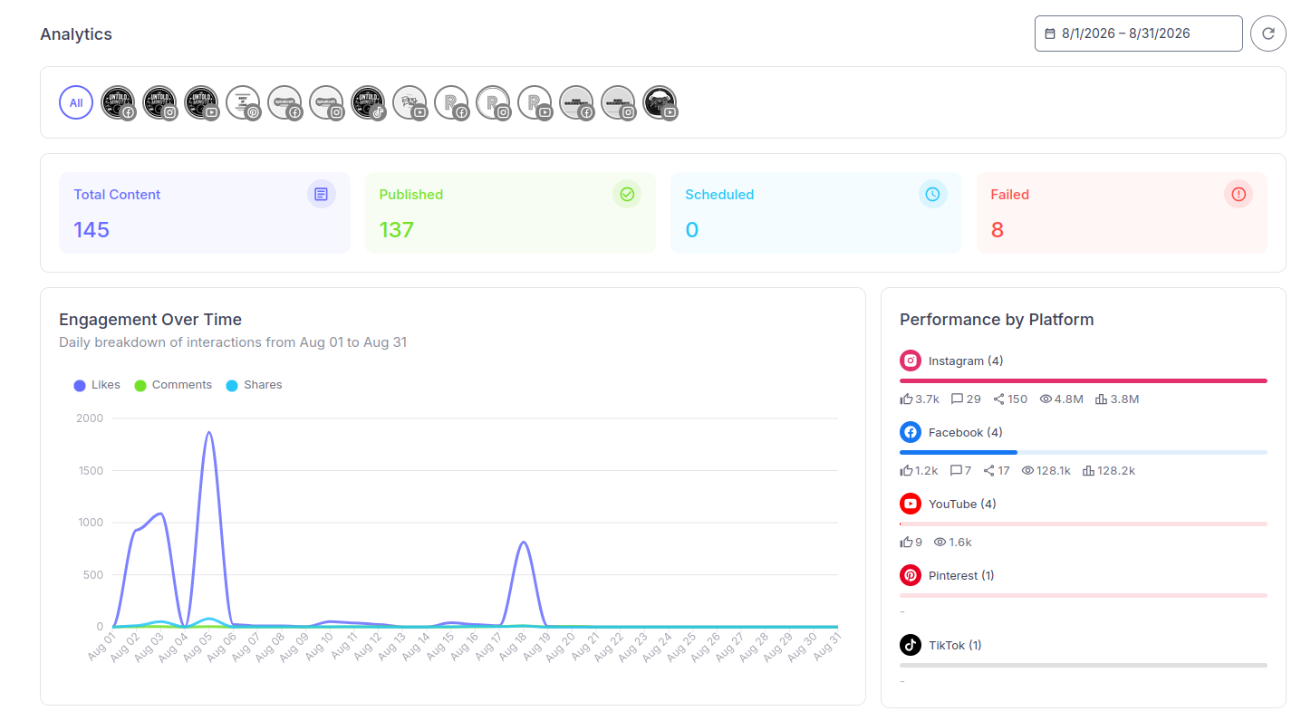
The Analytics page: summary cards, engagement over time, and per-platform totals — every connected account in one view.
Step 2: Read the Summary Cards
Four cards sit under the filter, each a one-glance status check for the period:- Total Content — how many pieces of content you handled, with a note of how many channels that was across.
- Published — how many went live, shown with a success-rate percentage.
- Scheduled — how many are still queued for the future.
- Failed — how many did not publish. This one is labelled “requires attention” for a reason.
Step 3: Engagement Over Time
The Engagement Over Time chart is a daily breakdown of interactions — Likes, Comments, and Shares as separate lines — across the selected range. What to look for:- Spikes. A sharp peak on one day almost always maps to one post that took off. Note the date and go find it in the top-posts list (Step 8).
- The comments and shares lines specifically. Likes tend to track volume; a day where comments or shares jumped tells you something resonated, not just that you posted more.
- The baseline. Is the quiet-day level trending up over weeks? That is compounding audience, and it matters more than any single spike.
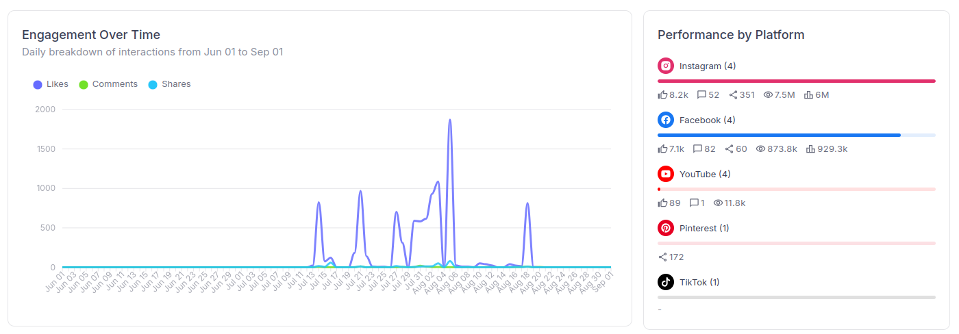
Engagement Over Time, with the Performance by Platform panel (Step 6) beside it. The early-August spike is one post that took off — the top-posts list tells you which.
Step 4: Follower Growth by Platform
The Follower Growth chart plots follower count over time, broken out by platform. Ignore the absolute numbers and read the slopes: which platform’s line is climbing steadily, which has flattened, which is drifting down. That tells you where your current effort is actually buying audience and where you are treading water — useful input when you decide which platforms to prioritise next month.Step 5: Channel Performance (and Export to CSV)
The Channel Performance table breaks metrics out per connected channel within each platform, with columns for Scheduled, Published, Failed, and Engagement. This is where you spot a single account dragging the averages — one channel with a stack of Failed posts, or one that publishes plenty but gets almost no engagement.The Export CSV button in the card header downloads this table for the selected date range. That is the fastest way to build a client or stakeholder report: set the month, export, drop it into your spreadsheet or deck.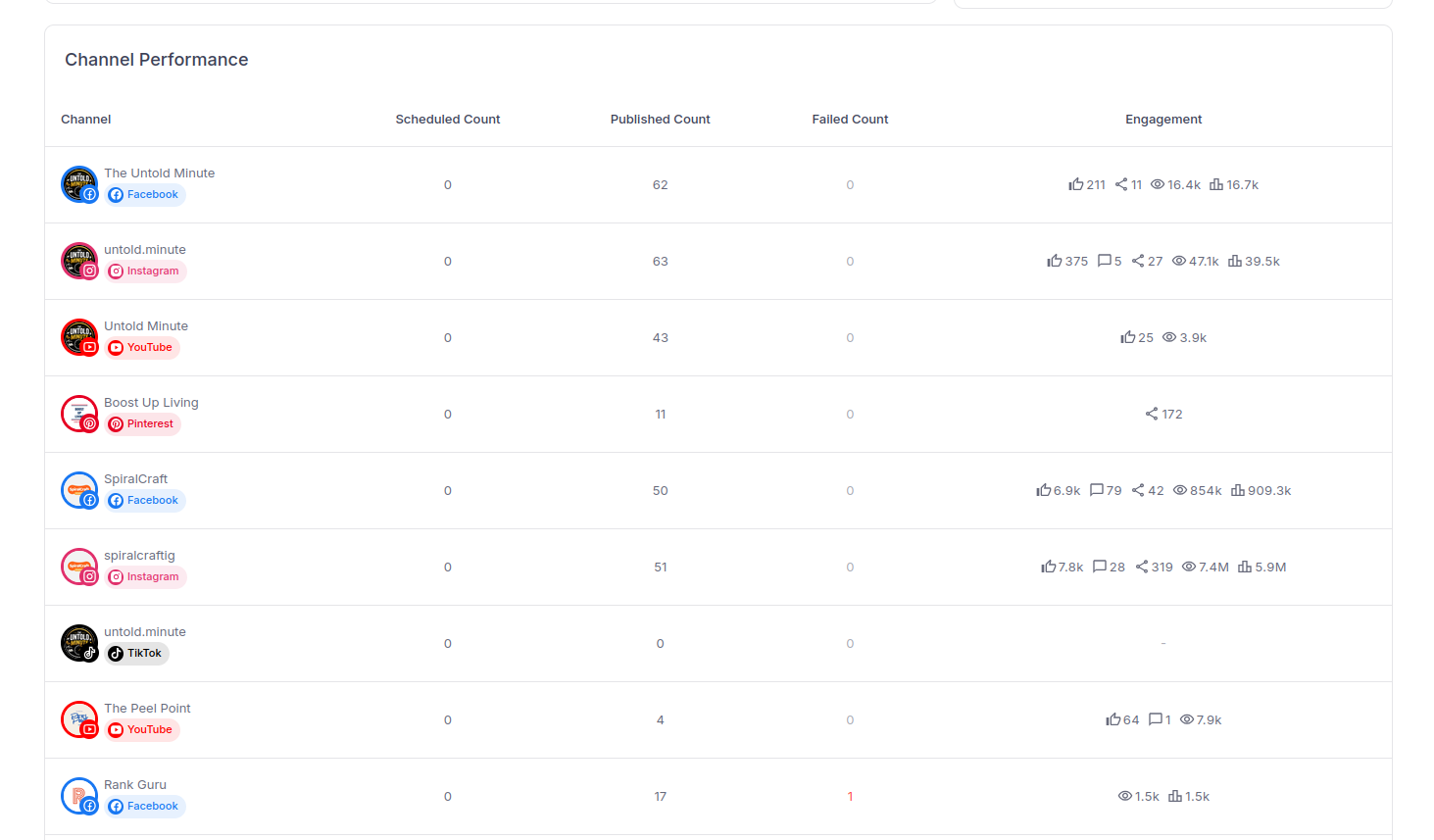
Channel Performance: every connected account on its own row. Scan the Failed column for a channel that needs attention, and the Engagement column for one that publishes plenty but lands little.
Step 6: Performance by Platform
Where the channel table is granular, Performance by Platform is the totals view — every metric accumulated from all channels on each network, with a count of how many channels feed it. Each platform row shows likes, comments, shares, views, and impressions side by side.This is the panel that answers “where is my effort paying off?” You might publish evenly across seven platforms and find that one or two produce most of the reach and engagement. That is not a reason to abandon the others, but it is a reason to make sure the top performers get your best work. If a platform has no data yet it simply shows a dash.Step 7: Content Mix vs. Content Performance
Two charts sit together here:- Content Mix — posts published by content type (Image, Video, Text). This is what you make.
- Content-wise Performance — engagement broken down by the same three types, with likes, comments, and shares per type. This is what performs.
Step 8: Find Your Top-Performing Posts
The Top Performing Content table ranks your published posts for the period. Sort it by Likes, Views, Comments, or Shares — each sort answers a different question. Columns show a thumbnail, the content, the channel, the date, and the engagement.Do not just note the winners — study them. Sort by shares and by comments (the harder-earned signals) and look for what the top posts have in common: format, hook, topic, length, time of day. Those patterns are your content strategy for next month, and the very best posts are the ones to repurpose across your other platforms.Step 9: Drill Into a Single Post
Open any published post to see its full Content Analytics: Likes, Comments, Shares, Views, Impressions, and Reach, plus a running total. Three charts go deeper:- Engagement Over Time — cumulative likes, comments, and shares since the post published, so you can see whether it had a long tail or died after a day.
- Engagement Breakdown — the share of interactions that were likes vs comments vs shares.
- Reach & Impressions Over Time — unique users reached vs total impressions since publish.
Turn the Numbers Into a Weekly Habit
A fifteen-minute pass, once a week, beats a deep dive once a quarter:- Set the range to the last 7 days.
- Check the Failed card. Fix anything that did not publish.
- Note your top three posts (sort by shares and comments) and one line on why each worked.
- Note your clearest flop and one line on why.
- Adjust next week’s content calendar based on those five lines.
Common Mistakes to Avoid
Reading engagement without reach
A post with more likes is not automatically the better post. Always divide by reach or impressions before you compare two posts, or you will chase volume instead of resonance.Reacting to a single post
One viral post and one flop are noise. Change your approach based on a pattern across the top-posts list over several weeks, not a single data point.Comparing platforms one-to-one
A “view” on YouTube, TikTok, and Instagram are three different things. Compare each platform against its own past, and use Performance by Platform for direction, not for a literal leaderboard.Ignoring the Failed count
It is easy to skip past because it is not about engagement. But every failed post is content you planned that your audience never saw. It is the highest-leverage thing on the page to fix.Frequently Asked Questions
Which platforms does Socialic’s Analytics cover?
Every account you have connected — Facebook, Instagram, Threads, LinkedIn, TikTok, Pinterest, and YouTube. The dashboard rolls all of them into one view, with per-channel and per-platform breakdowns underneath.What’s the difference between reach and impressions?
Impressions is how many times your post was shown, including repeat views by the same person. Reach is how many unique people saw it. A high impressions-to-reach ratio means the same audience is seeing your post repeatedly rather than it spreading to new people.Why does my Failed count matter?
Failed is the number of scheduled posts that did not publish, usually because a channel needs re-authorization or a platform rejected the media. A rising Failed count means posts you planned never went live, so check it first in every review.Can I export the data for a client report?
Yes. The Channel Performance table has an Export CSV button that downloads per-channel scheduled, published, failed, and engagement figures for the selected date range — ready to drop into a spreadsheet or report.How far back does the data go?
Use the date range picker at the top of the Analytics page to set any period. Platform APIs can lag or backfill, so very recent numbers may still be settling — give the last day or two a little time before treating them as final.Final Thought
Analytics is not about admiring numbers, it is about making next month’s content better than this month’s. Read reach before engagement, trends before totals, and patterns before single posts. Check what failed, study what worked, and feed both back into your calendar. Fifteen minutes a week is enough.Every platform’s numbers, in one view. One habit, every week.Try Socialic free
and see every platform’s performance from one dashboard.
Keep Reading
Analytics tells you what to change; the rest of the workflow is where you change it. Use how to schedule posts to every platform at once to act on what you learn, and how to manage every comment from one inbox to keep the engagement side moving.
Not connected yet? Start with how to connect your social media accounts to a scheduler.